The trailer for Terrence Malick's upcoming film, The Tree of Life.
"We trace the evolution of an eleven-year-old boy in the Midwest, Jack, one of three brothers. At first all seems marvelous to the child. He sees as his mother does with the eyes of his soul. She represents the way of love and mercy, where the father tries to teach his son the world’s way of putting oneself first. Each parent contends for his allegiance, and Jack must reconcile their claims. The picture darkens as he has his first glimpses of sickness, suffering and death. The world, once a thing of glory, becomes a labyrinth."
It's interesting to see a different take on the themes and ideas that have recently informed my own work. I'm not necessarily a huge Malick fan (loved The Thin Red Line, yawned my way through The New World) but he is a visually amazing director. That upside down shot of the boys' dancing shadows is hypnotic.
The film also strongly reminds me of Mitch Albom's novel, For One More Day.
18 December 2010
28 November 2010
Awe
Just another stunning painting from the masterpiece factory that is James Jean.

As deep of a slump as I feel like I'm in, seeing work like this makes me want to reach for a brush.
As deep of a slump as I feel like I'm in, seeing work like this makes me want to reach for a brush.
27 November 2010
The Pebble And The Magnet
Below is a piece that was (fairly) recently entered into a regional drawing prize. Working both on paper and in black and white was such a refreshing change of pace after all this painting. It reminds me that I originally entered art school with the intent of focusing on graphic illustration.

I recently completed my final semester with mixed feelings about the way the experience ended. In many ways, it was an abrupt regression after a a year and a half of progressive improvement, and I'm sufficiently discouraged by my final product that I don't want to post any images of those paintings.
Having made the immediate leap from art school to a full-time office job, I find myself increasingly distanced from my art-making practice. I am haunted by the words of a visiting artist whose primary advice was not to get bogged down in a "real job".

Beggars In The House Of Justice, 59.4 x 84.1 cm
Ink on Rives BFK
Illustrated October 2010
Ink on Rives BFK
Illustrated October 2010
I recently completed my final semester with mixed feelings about the way the experience ended. In many ways, it was an abrupt regression after a a year and a half of progressive improvement, and I'm sufficiently discouraged by my final product that I don't want to post any images of those paintings.
Having made the immediate leap from art school to a full-time office job, I find myself increasingly distanced from my art-making practice. I am haunted by the words of a visiting artist whose primary advice was not to get bogged down in a "real job".
24 October 2010
Imperfect Worlds
Cranking out some paintings for the end of year exhibition -- barely another week to go till deadline. Apologies for the delayed posting. As a consolation prize, here is an amazing vision of the future courtesy of video artist Keiichi Matsuda.
Interestingly, this video was part of Matsuda's final project for a Master of Architecture degree as part of a broader commentary on the increasing convergence between the built environment and media space and the increasing role of architecture in the consumer environment.
Interestingly, this video was part of Matsuda's final project for a Master of Architecture degree as part of a broader commentary on the increasing convergence between the built environment and media space and the increasing role of architecture in the consumer environment.
04 October 2010
Goodbye ...
Today's project, as inspired by yesterday's sketch. An ink drawing that went under the knife in Photoshop. Something that I may or may not use in future after I clean it up some.

Edit: a more refined version, below.


Edit: a more refined version, below.

03 October 2010
Two-Legged Dog
I'm stacking projects in a busier-than-usual busy time of year but it's kind of nice to be hustling and bustling. This is a two minute pen and marker sketch (and a much needed breather) that lies opposite a busy page of planning and note-taking.

I resisted the urge to draw in a Moleskin for a long time, both in deference to their price and (oft) pretentiousness of their owners. But this one was given to me and the paper is quite nice so goodbye, integrity!

I resisted the urge to draw in a Moleskin for a long time, both in deference to their price and (oft) pretentiousness of their owners. But this one was given to me and the paper is quite nice so goodbye, integrity!
27 September 2010
Bridesmaid
An accompanying piece for the show completed in a single marathon session stretching from 7AM-3AM. I think I would be happier with it if the first one hadn't turned out so well. It's not that I hate this one or anything; I just have a very average reaction to the final results.

At first I wanted to do something very strongly separate and even got so far as to introduce a vastly different background motif (somewhere between the 3rd and 4th stages seen below). But I just didn't like how it turned out and ended up painting over it.


If I wasn't pressing to meet a deadline, I would have liked to add a bit more tonal variation and subtle colour shifts. But at the end of that 20 hour shift I don't think I had either the motor skills or ocular focus to do so. Probably shouldn't have picked such a one-tone figure to paint either. Ah well. Bear it in mind for next time.

Requiem, 60 x 60 cm
Acrylic on particleboard
Painted September 2010
Acrylic on particleboard
Painted September 2010
At first I wanted to do something very strongly separate and even got so far as to introduce a vastly different background motif (somewhere between the 3rd and 4th stages seen below). But I just didn't like how it turned out and ended up painting over it.


If I wasn't pressing to meet a deadline, I would have liked to add a bit more tonal variation and subtle colour shifts. But at the end of that 20 hour shift I don't think I had either the motor skills or ocular focus to do so. Probably shouldn't have picked such a one-tone figure to paint either. Ah well. Bear it in mind for next time.
23 September 2010
A Potent And Lethal Addiction
New painting for the show next week. Done in three days. It would've been quicker, too, but at one point the panel fell face first onto my palette. I'm hoping to get another larger piece done over the weekend.

It's a continuation of the old G.I. Joe series from last semester. Not only because they were so fun to paint, but because I feel like there's a lot more I can do with them. This is an early attempt at producing an image with something a little more interesting than a one-tone background.


My sister says it reminds her of "The Hurt Locker". Huh. Cool thought but I didn't make the connection until she brought it up.

Hurt, 60 x 60 cm
Acrylic on particleboard
Painted September 2010
Acrylic on particleboard
Painted September 2010
It's a continuation of the old G.I. Joe series from last semester. Not only because they were so fun to paint, but because I feel like there's a lot more I can do with them. This is an early attempt at producing an image with something a little more interesting than a one-tone background.


My sister says it reminds her of "The Hurt Locker". Huh. Cool thought but I didn't make the connection until she brought it up.
16 September 2010
Renovations
I've been meaning to make some changes to this blog for a while, simply in the name of visual clarity. This is just a placeholder until I have the time/drive to design my own banners and backdrops. Please bear with the minor tweaking that may or may not happen over the next couple of weeks.

In other news, I am partaking in a group show at the end of this month. So if you are in Sydney come on down and bring your richest and most gullible friends.

In other news, I am partaking in a group show at the end of this month. So if you are in Sydney come on down and bring your richest and most gullible friends.
15 September 2010
It's A Boy
Well, this was a pleasant change from all the wall textures and chain link fence. I'm generally more happy with the figure's upper body than I am with the legs, but overall I'm quite pleased with the results given that it was rendered almost entirely from my imagination (hence the inconsistent lighting effects).

It's a strange thing, but I suspect that all the technical emphases of our first year drawing and painting classes instilled a reliance on photographic references that I haven't been able to shake. Whereas prior to art school I could generally just draw freely from mind. I guess that's why it felt so nice to kind of ad-lib this little section (with more to come).

I still have to render about a dozen or so intertwined trailing characters in translucent glazes so this painting is far from done. Originally, I planned to do three panels, but I'll be fortunate to complete two. Volume of work is my biggest concern right now but I'd rather hand in one excellent painting than two or three half-assed pieces.
09 September 2010
Tools Of The Trade
A snapshot of my painting table, complete with overused/abused paper palette and the two miniature brushes that I have rendered 85% of my painting with. No wonder it's taken so long.


07 September 2010
Heavy Lifting
Behold the labours of the past two months. A bit depressing considering how little way I've come and how far I've yet to go. But it is the most layered and detail-intensive painting that I've ever attempted.


You can follow my overtly pedantic process from the buildings in back to the foreground wall to, most recently, the nightmare that was the chain-link fence. Incidentally, I absolutely hate rendering architecture.
p.s. For those that know it, yes, the imagery was referenced from La Cancha. I tried adding the "Ole" graffiti but it looked pretty terrible.
03 September 2010
Wrong Side of the Bars
Courtroom sketches from a visit to Chelsea District Court in Boston earlier this year. Guess I forgot to post them at the time, but I just found them in an old notebook.


My favourite part was striking up a conversation with the guy next to me after he quipped, "Yo, you got mad skills," and then abruptly ending it when his name was called to be summoned before the judge.


My favourite part was striking up a conversation with the guy next to me after he quipped, "Yo, you got mad skills," and then abruptly ending it when his name was called to be summoned before the judge.
16 August 2010
Mission Statement
So I'm about one third of the way through my final semester at art school and desperately trying to bring my final body of work up to speed (hence, the lack of posts -- sorry!). This project is basically a thematic continuation of last semester's work, dealing with issues of loss and emotional displacement in the context of the transition from youth to adulthood.

Preliminary sketch on wood panel
Basically, I'm painting a series of panoramic narratives, each of which will depict a boy with a soccer ball conquering a legion of his own imagined foes. It's a pretty clear and shallow reflection of my infatuation with the recently ended World Cup, and I am desperately hoping that the final product won't look like a Nike ad, but the subject matter is both personally relevant and visually accommodating to the type of language that I want to use.

My life, circa 1991
The one condition I did impose was to confine all of my compositions to a strictly two-dimensional plane -- not as a conscious decision, by any means, but more in how I instinctively visualised the idea. I suppose it harks back to memories of my boyhood iconography: living in a two-button world where the only driving factor was to get Mario from the left side of the screen to the right. That's something that wouldn't make sense to a lot of my more academic teachers, but I look at these old NES games and see a beauty in that kind of honest visual simplicity, and I look at my recent work and see evidence of this aesthetic lineage.

Photo taken in Boston Commons (01/10)
I also think this framework is a perfect vehicle to explore the dynamics of human movement, which is probably a more longstanding artistic interest of mine. As someone who typically frames only one or two people at a time in an image, I'd like to really explore a more intricate and fluid composition of interacting characters in this series of paintings. Something akin to the complexity of Renaissance painting, which is generally something that I tend to steer clear of.

Nicolas Poussin's "The Battle"
On a more technical level, I'm trying to layer my acrylics in a series of thin coats to produce a well developed transparency effect, what with the juxtaposition of the child's imagined elements against the reality of the physical setting. It's pretty cliche, but one of my bow-down-and-worship-him contemporary influences is the painter/illustrator James Jean. The image below, for example, is a perfect demonstration of the kind of hard-graphic-on-soft-paint look that I want.

As it is, I'm still battling the first of three planned paintings. I've hashed out the basic underpainting and am currently fleshing out the background (something I really, really dislike doing ... rendering architecture). But after uploading them to my computer I realise that all the photos I've taken are pretty terrible. This post is long enough anyways. If you got this far, wow, I'm impressed.

Preliminary sketch on wood panel
Basically, I'm painting a series of panoramic narratives, each of which will depict a boy with a soccer ball conquering a legion of his own imagined foes. It's a pretty clear and shallow reflection of my infatuation with the recently ended World Cup, and I am desperately hoping that the final product won't look like a Nike ad, but the subject matter is both personally relevant and visually accommodating to the type of language that I want to use.
My life, circa 1991
The one condition I did impose was to confine all of my compositions to a strictly two-dimensional plane -- not as a conscious decision, by any means, but more in how I instinctively visualised the idea. I suppose it harks back to memories of my boyhood iconography: living in a two-button world where the only driving factor was to get Mario from the left side of the screen to the right. That's something that wouldn't make sense to a lot of my more academic teachers, but I look at these old NES games and see a beauty in that kind of honest visual simplicity, and I look at my recent work and see evidence of this aesthetic lineage.

Photo taken in Boston Commons (01/10)
I also think this framework is a perfect vehicle to explore the dynamics of human movement, which is probably a more longstanding artistic interest of mine. As someone who typically frames only one or two people at a time in an image, I'd like to really explore a more intricate and fluid composition of interacting characters in this series of paintings. Something akin to the complexity of Renaissance painting, which is generally something that I tend to steer clear of.
Nicolas Poussin's "The Battle"
On a more technical level, I'm trying to layer my acrylics in a series of thin coats to produce a well developed transparency effect, what with the juxtaposition of the child's imagined elements against the reality of the physical setting. It's pretty cliche, but one of my bow-down-and-worship-him contemporary influences is the painter/illustrator James Jean. The image below, for example, is a perfect demonstration of the kind of hard-graphic-on-soft-paint look that I want.

As it is, I'm still battling the first of three planned paintings. I've hashed out the basic underpainting and am currently fleshing out the background (something I really, really dislike doing ... rendering architecture). But after uploading them to my computer I realise that all the photos I've taken are pretty terrible. This post is long enough anyways. If you got this far, wow, I'm impressed.
26 July 2010

23 July 2010
Green Grass And Blue Skies
Some examples of the unconventional sports photography of Hans van der Meer, the primary artistic influence on this semester's major work. His linear composition and emotionally detached narratives are both elements that I would like to emulate in my painting.


As a nice little bonus, looking at this collection of photography has inspired me to shoot for the first time since I returned from the United States at the beginning of the year. I'm currently halfway through yet another roll of good old fashioned Ilford XP2, though I've also got some 200 ISO slide film sitting around waiting to be played with.


As a nice little bonus, looking at this collection of photography has inspired me to shoot for the first time since I returned from the United States at the beginning of the year. I'm currently halfway through yet another roll of good old fashioned Ilford XP2, though I've also got some 200 ISO slide film sitting around waiting to be played with.
06 July 2010
Runnin' Man
I recommend this to anyone who wishes to pursue a career in any sort of creative industry. The Run Up is a documentary series that follows a number of artists from varying fields, disciplines, and lifestyles. In other words, 180 minutes of pure inspiration.

Here's a pair of excerpts from two of my personal favourites (one and two). Big ups to my brother for the awesome birthday present.

Here's a pair of excerpts from two of my personal favourites (one and two). Big ups to my brother for the awesome birthday present.
05 July 2010
Facing The Music Like A Graduate of Juilliard
Just trying to hammer out the idea behind my upcoming major work before this break ends. In a perfect world I'd be able to hash out my composition, gather all the specific imagery, and prep all my materials so I could hit the ground running and start painting when school starts. But I am still tossing up a number of concepts. Today I'm feeling something along the lines of:

+

It's tempting to go for another series of linear panels, but I'm feeling pretty high on the challenge of a single, epic, Guillaume Bresson-type oil painting. As much as I loved working with acrylic last month, I really want to get a handle on photorealistic oils -- something I've never been able to achieve. This is going to be my last semester at art school and I want to go out with a bang so I figure I might as well roll the dice.
01 July 2010
Out Of This World
A beautiful example of videogames as art. It's like a charcoal drawing in motion.
Also reminds me of the wonderful Another World which I once upon a time had on the SNES.
Also reminds me of the wonderful Another World which I once upon a time had on the SNES.
20 June 2010

16 June 2010
Men Become Boys and Boys Become Men
Here are those last three acrylics. In the end, I was only half a day over my intended five-in-five timetable. Not bad, not bad.


I'm quite pleased with how this project turned out -- in fact, it may have just convinced me to use acrylic for my final semester's major work. Food for thought, I guess.


I'm quite pleased with how this project turned out -- in fact, it may have just convinced me to use acrylic for my final semester's major work. Food for thought, I guess.
14 June 2010
It's In The Bag
As time-consuming as this animation would have been to make, it came together so, so well.
This Is Where We Live from 4th Estate on Vimeo.
In other news, my paintings are done (just have to paint the edges and touch up the backgrounds). Assessment date's tomorrow so photos should follow soon.
08 June 2010
Three Days of the Condor
Three down, three to go.
The head on this guy looks a bit potato-ish; I might have to re-touch that face. I'm also not too keen on that hand on the right. The blue vest was giving me nightmares but actually turned out alright. And though you can't really see it in this crappy photo, I must say, the light on that arm on the left -- amazing! Even a blind dog finds a bone once in a while.

The splotch on the background is an annoyance that I will have to deal with later, and one I know will lead to much cursing.
07 June 2010
No Known Survivors
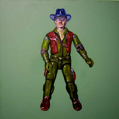
Here's an update on the second project that I'm trying to sandwich into the tail end of the semester. I started these six canvases a few months ago but they've since undergone some serious renovations. To be honest, I'm just having fun getting reacquainted with acrylics and banging out these G.I. Joe portraits. For some reason I find it 1000x easier to do photorealistic renditions with these paints than oils. And it's a nice bonus to not have to worry about chemicals or wait a day between layers.


I'm currently on a painting-a-day schedule since everything's due next week but it's not as bad as it sounds because, despite the time crunch, it's been quite a pleasant experience. I actually think that self-imposed pressure has helped, too, at least insofar as making me a bit more subconsciously decisive. It's kind of like when I drive to school -- since there's only 1 hour parking and I have to go out every so often to move the car, I find that I'm much more productive in terms of what I squeeze into every 60 minutes.

Anyways, that's all I got so far. I'll try to post as I go and take some better photos (those backgrounds are actually completely flat and tonally identical).
Subscribe to:
Comments (Atom)