Showing posts with label oil paint. Show all posts

05 July 2010

Facing The Music Like A Graduate of Juilliard

Just trying to hammer out the idea behind my upcoming major work before this break ends. In a perfect world I'd be able to hash out my composition, gather all the specific imagery, and prep all my materials so I could hit the ground running and start painting when school starts. But I am still tossing up a number of concepts. Today I'm feeling something along the lines of:


+


It's tempting to go for another series of linear panels, but I'm feeling pretty high on the challenge of a single, epic, Guillaume Bresson-type oil painting. As much as I loved working with acrylic last month, I really want to get a handle on photorealistic oils -- something I've never been able to achieve. This is going to be my last semester at art school and I want to go out with a bang so I figure I might as well roll the dice.

30 May 2010

Burning' and Lootin'

First work: done.

Not that there isn't more to do on this one -- the tones on those signs should be a little more consistent. That baseball player needs way more black on his upper body and shoes. I could probably work a bit more on the panel transitions. I definitely need to figure out how to hang these panels (D-rings?)


Sadly, it's a numbers game now. I've got two weeks left to finish my other much more neglected major work. If there's time, I'll address these issues as best I can. Compromise is such an ugly thing.

It's probably still too fresh to decide whether I like this piece or not. I can say that I don't love it. But maybe that's because I can't help but think about the concessions I had to make to my original idea of having these portraits be life-sized on door-sized panels of wood. I wish there was a way to make this happen, but I'm not even one of those people that can re-visit a work to touch it up, let alone recycle the same idea.

20 May 2010

Triplets

The photo quality isn't great, but here's a quick look at the three panels that I've done so far.


Batman's been a problem child since day one, and to be honest, there's still something about him that gets under my skin. Unfortunately, I have neither the time/effort to re-attempt that particular panel, and I can't think of anything that I could do different to make it better. Hmmm. I guess I'm getting a bit over this project, as evidenced by the steady decline in quality/enthusiasm since the astronaut.


Anyways, three down with the remaining two primed and ready. Next Friday is my D-Day.

15 May 2010

Haterade

Two down, with a third about 3/4 done and the last two prepped and on deck.


Some lingering issues:

1) That text really irks me. I'll wait till all five panels are painted and then re-do it all.

2) I didn't notice at first, but my studio neighbour astutely pointed out the abrupt transition between the panels. Again, I'm going to wait till I've got everything done before adding some cross-panel drips to smooth it out a bit more and add a bit of visual continuity. (Thanks, Nick)


On a side note, whilst prepping my remaining panels with a yellow undercoat the baseball player I'd painted earlier turned out as pictured. Dig that soft look. People have been telling me to include it in the sequence but I think homogeneity's an important part of this project. Maybe if I had a mulligan I'd steer the whole thing in that direction, but it's surely way too late now.

06 May 2010

Frontiers

A quick recap:

I had this idea waiting on deck pre-semester so was able to hit the ground running -- concept sketches, materials, laying-out and image prep was all done in the first 2-3 weeks. And then a month and a half of flatline. I had my subject matter down, knew how and where everything had to be, but just couldn't figure out the painterly aesthetic that I wanted.


E.g. three early iterations of the first image I tried painting. I'm actually quite fond of the one on the left but (error of all errors) I plotted a new course after some negative feedback from the one teacher in my class whose opinion I actually value. Hence, the increasingly butchered attempts. In terms of the figure, it turned out okay but I immediately and adamantly knew that I could do better.


Behold the breakthrough (above). The lightbult moment came as I was staring at the texture of the floor in the painting studios during a group crit, and was further reinforced by the chance discovery of this jacket cover for Matt Kindt's "Superspy". This led to the profuse experimentation with dripped solvent and glazed paints. I'm extremely happy with the end result. That background combined with the slashed paint strokes on the astronaut give the piece the whole street art feel that I was so depserately searching for.


Now all I have to do is get the rest of the pieces up to speed. Which isn't too bad considering that the astronaut only took me two days all up and I've got the blueprint for the whole process in my pocket. Most importantly, however, is that this project is now fun again. No more banging my head against a wall.

Only four teacher assisted weeks left in the semester and counting so I'm glad that things are finally coming together. Let's see how it goes from here.

24 January 2010

Flesh Painter

I feel like a lot of photorealistic artists straddle the line between achieving something in their work that's technically amazing and conceptually interesting -- rarely, however, is it both. Alyssa Monk is an exception to this rule. Her work is so consistently mind-blowing and uniquely ambient that I find myself sifting through her dozens of paintings and loving each and every one of them.


I do kind of wonder about the photo reference for that baby though ...

14 January 2010

Retrospective For Life

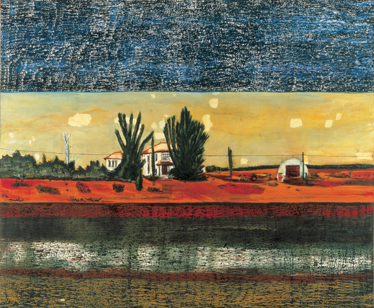
These are the last two paintings that I did in the semester prior to my exchange in the States, the first of which was an exercise in transparent/flat/broken colour, and the second a collage project. I was happy with them at the time and I'm still quite pleased with them now but it's strange to see how different they are to my last batch of projects.


3 Sachel Youths, 60 x 84 cm
Oil paint on canvas board
Painted May 2009


Baby Irma, 42 x 30 cm
Oil paint and mixed media on canvas
Painted May 2009

I only started painting in about August 2008 -- involuntarily I might add, since at the time I was only interested in the 'drawing' portion of my Drawing & Painting major. That semester was an exercise in brutality, too, as we were forced through the monotony of dozens of still lives and technical exercises, the results of which were predictably abysmal.

But over the summer break I made it my goal to actually learn something about painting and worked on a couple of canvases for fun (it also happened to coincide with my need for an artistic portfolio for my exchange application). Here's an early example:


Lupe the Fiasco, 42 x 30 cm
Oil paint on canvas
Painted January 2009

I look at this now and it seems so rudimentary. But at the time it was a huge breakthrough for me -- I was actually having fun while I was painting. One of the best pieces of advice I ever received from a teacher at art school was, in response to my whining about how I wasn't used to handling a brush, to paint as if I was drawing; to make the medium one that you were familiar with. That's probably why all of the above paintings are characterised by these bold linear outlines. Eventually, I progressed from a paint-by-numbers approach to something with a little more tonal variation and textural qualities. And these days, I feel like I don't need that crutch anymore.

It's surreal for me to see the exponentional difference in my paintings and approach to the medium from this time a year ago. Technically, I feel a lot more confident, and aesthetically, a lot more willing to experiment. It's definitely encouraging. Because as much as I learned and grew in 2009, I'm greedy enough to want even more this year.

01 December 2009

The Lammer

My last painting for my Junior Painting class. Working in conjunction with the previous one, the two comprise an exploration into the idea that portraiture can be about more than just the depiction of an individual. The people that we choose to paint and draw inadvertently map out who and where we are at specific moments of our lives.

Consider that the subject of these paintings - my housemate for the past four months - is a person from the opposite side of the globe that I happened to meet by chance in this small town in upstate New York. Very soon our paths will diverge once more. But for this short period we existed in such close proximity.


Guitar Hero, 90 x 60 cm
Oil paint on canvas
Painted November 2009

Painting this felt about a million times better than the last piece. It was just nice to loosen up and go for a much more relaxed and casually intimate aesthetic. My source image was a grainy little photo on my phone and I think that gave me the leeway to play with the colour and composition. I do have some issues with the nondescript background (something that I think carried over from the last painting) but overall I'm happy with how it all turned out.

Here are a few more pictures of the painting in various stages of utero:


The area that I'm probably happiest with is the pthalo blue shirt design. I originally thought it would prove to be the stiffest challenge but I think (hope?) it turned out quite well.

22 November 2009

Spanish Armada

Here's my latest painting, the first of two portraits for my final project. A while ago I promised my housemate that I'd make a painting for him before we left. And with our semester about to end I figured I better hurry up and make good on it. So here it is, from the preliminary paint sketch ...


... to the final thing.


Gitano, 120 x 60 cm
Oil paint on canvas
Painted November 2009

I wanted to go for a softer, more painterly look and while I am generally pleased with the result I also feel like I've lost a lot of what made the way I've been painting recently so interesting. It just looks so ... average, I guess. Maybe that's because I'm not technically proficient enough to blow anyone away with this kind of classical approach. I think that my next painting will be a bit more gestural; hopefully a happy balance between the painterly styles I've been playing with. Below is a rough sketch that I just did on the canvas:


Not sure how "realistic" I want it to end up looking. But the image is a phone photo of my housemate rocking it out on Guitar Hero.

05 November 2009

Fastbreak

Here's the initial paint-sketch I worked off of. I always start my paintings as if they were line drawings, which I guess explains why I end up with a relatively graphic look at the end.


Here's the final piece after a few more adjustments. My bloody camera still isn't capturing the colours on the back wall which is fairly annoying, but oh well, what can you do.

Do It For The Kids

My latest painting. Sort of a thematic continuation of the last one I did. At least insofar as the subject matter is similarly derived from a movie still (i.e. a scene from Alfonso Cuaron's Children of Men). Again, I wanted to supplant the importance of the image's original context with a greater sense of painterly atmosphere and narrative ambiguity.


Untitled, 150 x 120 cm
Oil paint on canvas
Painted November 2009

This is the largest painting I've worked on to date. It was a lot of fun having so much space to move the brush around, but of course that also meant that I had to fill it all. A couple of nagging issues -- I had trouble rendering the female character's face given that I wanted the emphasis to be placed on the body language in the piece. I'm thinking that I'll go back in and add a little more darks to it. Likewise, I still have to properly render the hand just to the right of the central figure's head. At the moment, it looks like a minced hamburger patty.

While I'm griping, I'd like to also add that this isn't the greatest photograph in the world. The back wall isn't quite that acidic looking in real life; it's a lot cooler and more subdued.

Ah, well. I'm going to go back to the studio right now to fix all this. So hopefully that'll mean that a follow-up post is shortly on the way.

04 November 2009

Tardy

This is getting to be a bad habit, but once again I'm going to apologize for the inconsistent posting. I actually finished a painting for a crit today but there's one area that just irks me and I don't want to post any pictures up until I fix the bloody thing. Yeah, I'm a little bit anal.


This here's a test run for a silkscreen that I made a couple of weeks ago. For some reason I never posted it. I haven't played around with it as much as I want to but eventually I'll run the thing in a variety of colours over some painted grounds.

20 October 2009

"Tomorrow Ain't Promised To No One"

Apologies for the lax posting. I was in a Philly for a while and got a bit sidetracked.

Here's my latest painting. Aside from the undercoats, it was done in a two day marathon session (ah, deadlines).


Keema, 150 x 90 cm
Oil paint on canvas
Painted October 2009

The actual image is an appropriation of a still from the HBO show "The Wire" (good viewing, check it out). But the artistic inspiration behind this piece was Peter Doig's work -- and in particular, his painting "Grasshopper" [below]. Love that texture!


It's not necessarily evident in the above piece, but I love the way that Doig mutates pop-culture imagery beyond any kind of purely figurative reading. He robs the viewer of any context, instead relying on that mystery of place to create an atmosphere of cultural nostalgia. What happened right before this point in time? And just after? I also really like how he relies on body language rather than facial expressions, as well as how he'll often completely abandon his initial reference entirely. On a technical level, I love Doig's stubbornly horizontal brushstrokes. He typically employs a three-tiered set of bands in his work (as seen above) which is something that I tried to replicate (without making it too harshly evident).

I actually had a lot of fun painting this one despite the time crunch. Next up is a 4 x 5 foot canvas, oof.

05 October 2009

Les Hommes d'FIFA

Just finished this painting for a project revolving around "flat space". I wanted to emulate the flatness of traditional Japanese composition using an image taken from the 2006 World Cup (that's Michael Ballack rising up for the header).


Untitled, 90 x 120 cm
Oil paint on canvas
Painted October 2009

I wanted to take some risks and really push myself on this one and while I am glad that I did I definitely have a lot of issues with the final product. Things just did not go well right off the bat -- the canvas didn't stretch particularly tight; my initial sketch was plagued with horrible anatomy; etc. I wanted to employ a range of mark-making in this sort of Les Demoiselles d'Avignon composition but the whole thing just feels rushed and scrappy.

17 September 2009

Starting From Scratch

Here's a detail shot of the oil painting from my current two piece project. Since the other half was a print, I decided to emulate the feel of an etching by scratching in some rough lines with a nail. Unfortunately, I ended up with a painting that looks like an etched print and a print that looks like an oil painting. Sigh.

The Public Eye

An oil painting/monoprint tandem project. The two images are meant to relate and bounce off one another. I was going for a two-panel sequence of a security camera type of deal.


I'm really pleased with how the monoprint's cracked static image turned out but I'm afraid it's not very congruent with the scratched-in style of the oil painting. I don't consider these fully resolved pieces and will try and work back into one or the other or both tomorrow morning before class and see what I can do. We'll see how it turns out. At this point I just need some shuteye.

14 September 2009

Director's Commentary

Here's a play-by-play of how this latest painting unfolded.


I started out with a red and yellow ground and built up some arbitrary pockets of colour. Originally, I envisioned the buildings on either side to be depicted in a highly realistic manner but I quickly strayed from that idea. Probably because the research requirements and time restrictions were cramping my style. But I like the monolithic look that I ended up with.


After shading in the walls, I turned my eye to the sea. This was one of those paintings where I got so caught up in the actual process of moving the paint on the canvas that it took me a while to step back and realise that it just didn't look that good. This is definitely pre-epiphany. The colours are so muddy and uncohesive and that pthalo green sticks out like a sore thumb.


At this point I was concerned with revamping the tonal qualities of the piece. I painted over a lot of the darker areas with ultramarine blue. I'd say this was probably the turning point since that change ended up characterising the entire thing.


After going back and looking a lot more closely at Tomory Dodge's work, I actually began to source my visual material instead of basing it on memory. Hence the vertical textures and cross-hatched areas. Also a bigger alteration in terms of the way the brush strokes actually looked.


The final touches consisted of darkening the shadows and adding in the surfer and sky. I knew I wanted the latter to retain that reddish colour and ended in shading in a crude cloud structure to complement the light-to-dark transitions along the walls. The surfer was a bit tricky and took me a few times but I ended up using a bit more violet in the blacks to subtly make him pop.

That's about it. Sorry if this ended up sounding self-congratulatory and pretentious. But hey, what can you do.

Red Sky Diaries

Here's my landscape painting. It's been two weeks in the making -- kind of a visual combination of "Point Break", "Apocalypse Now", and "The Road", I guess. Actually, the style is a direct emulation of Tomory Dodge. I was looking to capture those really visible and deliberate brushstrokes.


Untitled, 120 x 60 cm
Oil paint on canvas
Painted September 2009

Here is a detail shot ... just because:


I'm quite pleased with how it all turned out because at one stage (as is always the case) I was ready to turn this canvas into kindling.

11 September 2009

Connections

This painting is an extension of the systems of chance printmaking project. In continuation of the theme, I randomly selected one of my Facebook friends and asked her to supply me with what she thought was the best photo she had ever taken. This image, of a child on the streets of India, was the result.


Untitled, A1 dimensions
Oil paint on paper
Painted September 2009

Some things that I need to work on (courtesy of today's critique session): the transition from dark to light is too abrupt, especially on the left shoulder. The colours are a bit overdone, especially on the clothing where things get a bit confusing. The folds themselves aren't especially well done. That jutting vertical line in particular irks me.

Overall, however, it was a fun painting to do that came together quickly and easily. Plus, I enjoyed the constructive criticism. It's all stuff that I agree with and would like to incorporate into my work moving forward.

10 September 2009

Boy Wonder

Here's a detail shot for an oil painting on paper that I hammered out in about 2 hours. There's still a few kinks to work out tomorrow so I'll post the whole thing then.